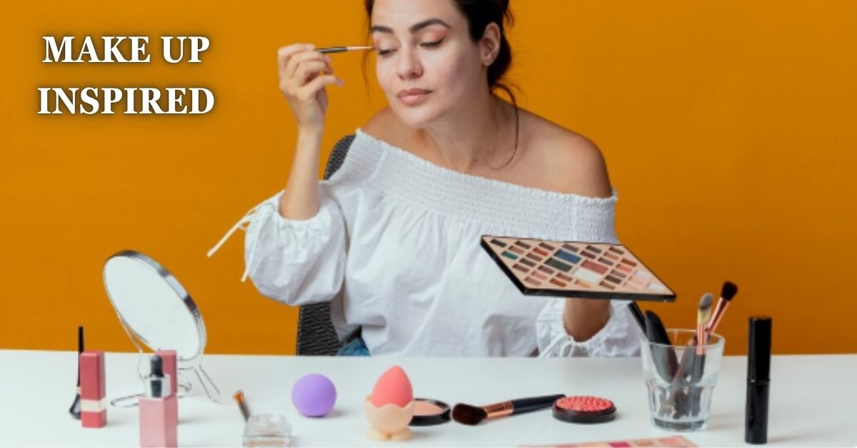
Every guide on this topic hands you a color wheel and a list of dress-to-eye shadow pairings, then stops there. What most of them leave out is the part that actually decides whether the result looks put together or like you raided a costume box, which single color you pull from, and how you match its finish, not just its hue. Makeup inspired by your outfit works when it reads as one deliberate choice, not a head-to-toe color match.
This piece covers exactly how to pick that one color, why the finish of your outfit matters as much as its shade, and a real reference list for the colors people search for most. By the end, you will be able to look at any outfit and know within seconds what to do with your face.
In Short
Makeup inspired by your outfit means pulling one color, usually from a trim, print, or accessory rather than the dominant fabric shade, and echoing it in a single feature like eyes or lips. Matching the whole palette across your face tends to look costumey, while one intentional echo reads as styled.
What Makeup Inspired by Your Outfit Actually Means
The phrase covers a specific styling move, letting your clothing choose the direction of your makeup instead of picking a face first and building an outfit around it. It is not the same as matching your eyeshadow exactly to your dress. A cobalt blue dress does not need cobalt eyeshadow, it needs a makeup choice that acknowledges the dress exists and works with its temperature and mood.
Most people who search this term have an outfit already chosen, a red slip dress, a green blazer, a floral midi, and want to know what to do with their face so the whole look feels finished. The answer changes by color, but the method behind it stays the same every time.
The One-Color Rule Almost Nobody Follows Correctly
Here is the detail most articles on this topic skip entirely. When people say “match your makeup to your outfit,” they usually mean pull from the dominant fabric color, the main body of the dress or top. That is actually the weaker choice. The stronger move is pulling your inspiration color from the smallest detail in the outfit instead, the piping on a blazer, the flecks in a tweed jacket, the lining peeking out of a coat, a single stripe in a print, or a metal button.
A small detail color reads as intentional rather than literal once it shows up on your face. If you wear a black dress with gold hardware, gold liner or a warm gold-flecked lid does more for the outfit than trying to interpret “black” as a makeup color would. This works because the eye already registers the small detail as a highlight in the outfit, so echoing it on your face extends something the eye was already drawn to, instead of introducing a new color decision that competes with the garment itself.
Once you start looking for the trim color instead of the dominant color, outfits that seemed to have no obvious makeup direction, all-black looks, neutral knits, plain white shirts, suddenly have an answer. Look for the zipper pull, the button, the stitching, the lining, or the one accessory you’re planning to wear with it.
Matching by Finish, Not Just Color
Color gets all the attention in this topic, but finish decides just as much of whether the pairing works. A matte, structured fabric like wool crepe or a tailored cotton shirt pairs naturally with matte or satin-finish makeup, foundation, blush, and eyeshadow with minimal shimmer. The clean lines of the garment and the clean finish of the makeup reinforce each other.
Satin, silk, sequins, or anything with visible sheen calls for the opposite logic. A dewy base and a touch of shimmer on the lid pick up and reflect light the same way the fabric does, which is why a dewy finish tends to photograph and read better against reflective fabrics than a flat matte base does in the same lighting. Pairing a fully matte face with a sequined top usually reads as slightly flat, the outfit is doing all the shine work and the face looks dull by comparison.
Texture mismatches are the quiet reason a lot of makeup inspired looks fall short even when the color choice was correct. A perfectly chosen berry lip on a chunky knit sweater can still look slightly off if the base underneath is glowy and dewy when the sweater’s texture calls for something more matte and grounded. Getting the finish right first, then choosing color within that finish, produces a more consistent result than picking color alone.
Makeup Inspired by Outfit Color, a Quick Reference
Once you’ve identified your inspiration shade, whether it’s the dominant color or a pulled detail, these are reliable starting points by color family:
- Black: gold, bronze, or warm brown liner and a soft berry or brick lip, avoid stark black-on-black which can look severe rather than intentional
- Red: neutral bronze or terracotta eyes with a nude or soft peach lip, save red lipstick for when the outfit isn’t already red, doubling red rarely works
- Blue (navy or cobalt): warm copper or peach tones on the eyes, since warm shades sit opposite blue on the color wheel and keep the face from looking cool and washed out
- Green (olive or emerald): warm brown or rust eyeshadow, a green outfit already reads as a statement color, so the face works better staying warm and grounded
- White or cream: soft pink or champagne tones across cheeks and lids, anything too bold competes with how much visual space a light outfit already takes up
- Pastels: a single deeper accent, like a rose lip with a pale pink top, rather than matching pastel-for-pastel, which tends to wash the whole look out
- Prints and patterns: pull one color out of the print, ideally the least common one in it, and use that as your single face color rather than trying to reference the whole pattern
These are starting directions, not fixed rules, skin tone and undertone still shift what actually flatters you within any of these color families.
Building the Look, Step by Step
Once you know which color you’re pulling and roughly which finish direction fits the fabric, the actual application follows a simple order.
- Choose the inspiration color from the smallest detail on the outfit, not the dominant fabric shade, using the trim, hardware, or print method above
- Decide the finish direction based on the fabric, matte and structured pairs with matte makeup, sheen and drape pairs with a dewier base and some shimmer
- Pick one feature to carry the color, eyes or lips, almost never both at full intensity, since doing both usually tips into costume territory
- Keep every other feature neutral, if the eyes are doing the work, keep the lips a soft nude or your natural shade, and the reverse if the lips are the feature
- Check the whole look together in daylight and artificial light both, since a color that reads as a subtle echo under one kind of lighting can look louder under another
Following this order matters more than any individual color choice, since skipping straight to color without deciding the feature and finish first is usually what produces a mismatched result even when the shade itself was reasonable.
Where Makeup Inspired Looks Actually Go Wrong
The most common mistake is trying to reference the outfit in more than one feature at once, bold eyes and a bold lip and a matching blush, all pulling from the same color story. Individually each choice might be defensible, but stacked together they stop looking like styling and start looking like a costume built around a single color.
This happens because the logic feels consistent from the inside, if red works on the eyes, red should work everywhere, but a face reads as a whole rather than as separate features viewed in isolation. Three loud choices compete with each other and with the outfit, while one intentional choice against a calm face gives the eye somewhere clear to land. The fix is genuinely simple once you see it, pick the single feature that flatters you most and let everything else support it quietly, rather than distributing the color evenly across your whole face.
When to Skip the Match Entirely
Not every outfit needs a color echo, and forcing one when the outfit doesn’t call for it is its own version of the same mistake. Busy prints, sequined or embellished pieces, and anything already carrying several colors at once tend to look better with a genuinely neutral face, since there’s no room left for another color decision without overcrowding the whole look.
Workwear and formal occasions where the outfit itself is doing the statement, a sharp blazer, an evening gown with dramatic structure, also often call for restraint rather than a literal echo. In those cases, a well-executed neutral face, defined brows, a bit of bronzer, a nude or your-lips-but-better lip color, does more for the overall look than trying to force a color connection that isn’t naturally there. Knowing when not to match is as much a part of this skill as knowing how.
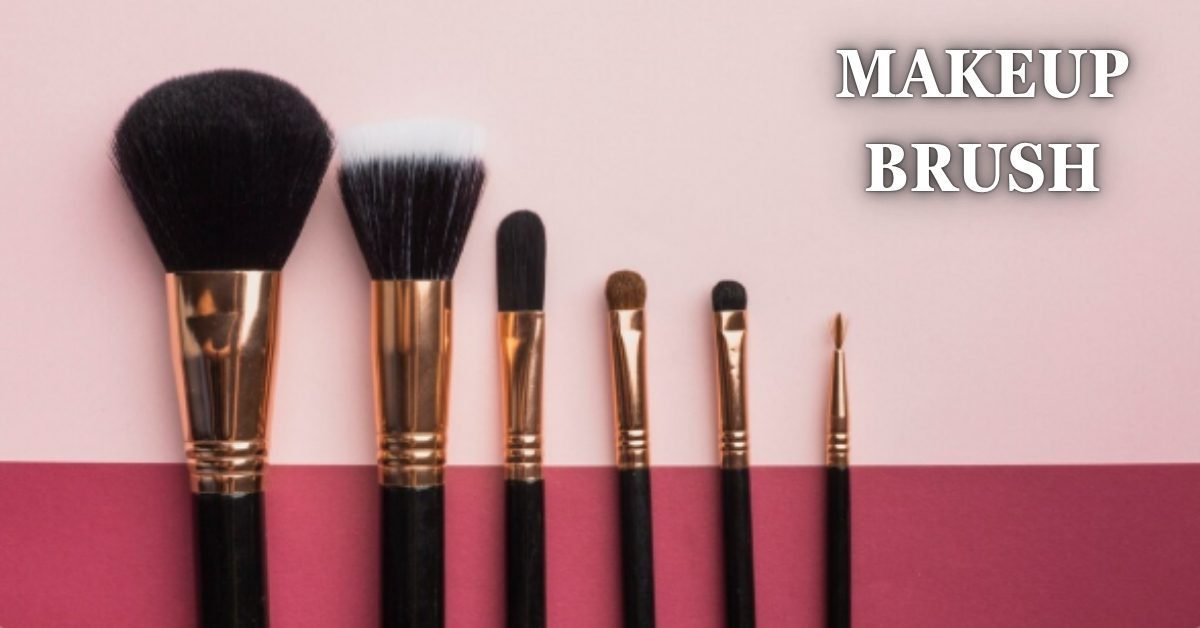
If you’re working through the actual application, a well-chosen brush set changes how precisely any of these colors go on, especially for placing a single accent shade cleanly rather than dragging color across more of the lid than intended.
Conclusion
Make up inspired by your outfit works best as one deliberate echo, not a full palette match, pulled from a small detail in the outfit and matched in finish as much as in color. Start your next look by finding the one accent color in what you’re already wearing, gold hardware, a stripe, a lining, and build from there instead of starting with the dominant fabric shade.
FAQ
Should my eyeshadow match my dress exactly?
No, an exact match usually looks flat and overly literal, a related or complementary shade pulled from a detail in the outfit reads as more intentional than a direct color-for-color match.
What makeup goes with a black outfit?
Warm tones work best, gold or bronze on the eyes with a berry or brick lip, since pure black makeup on a black outfit tends to look heavy rather than polished.
Can I match my makeup to a patterned outfit?
Yes, pull one color out of the print, ideally the least dominant one, rather than trying to reference the whole pattern across your face.
Does skin tone change which “inspired” color works?
Yes, the color family suggestions here are starting points, your undertone still determines which specific shade within that family actually flatters you.
Is it outdated to match makeup to an outfit at all?
No, the styling move itself still works well, what has changed is the approach, current styling favors one subtle echo over a full head-to-toe color match.